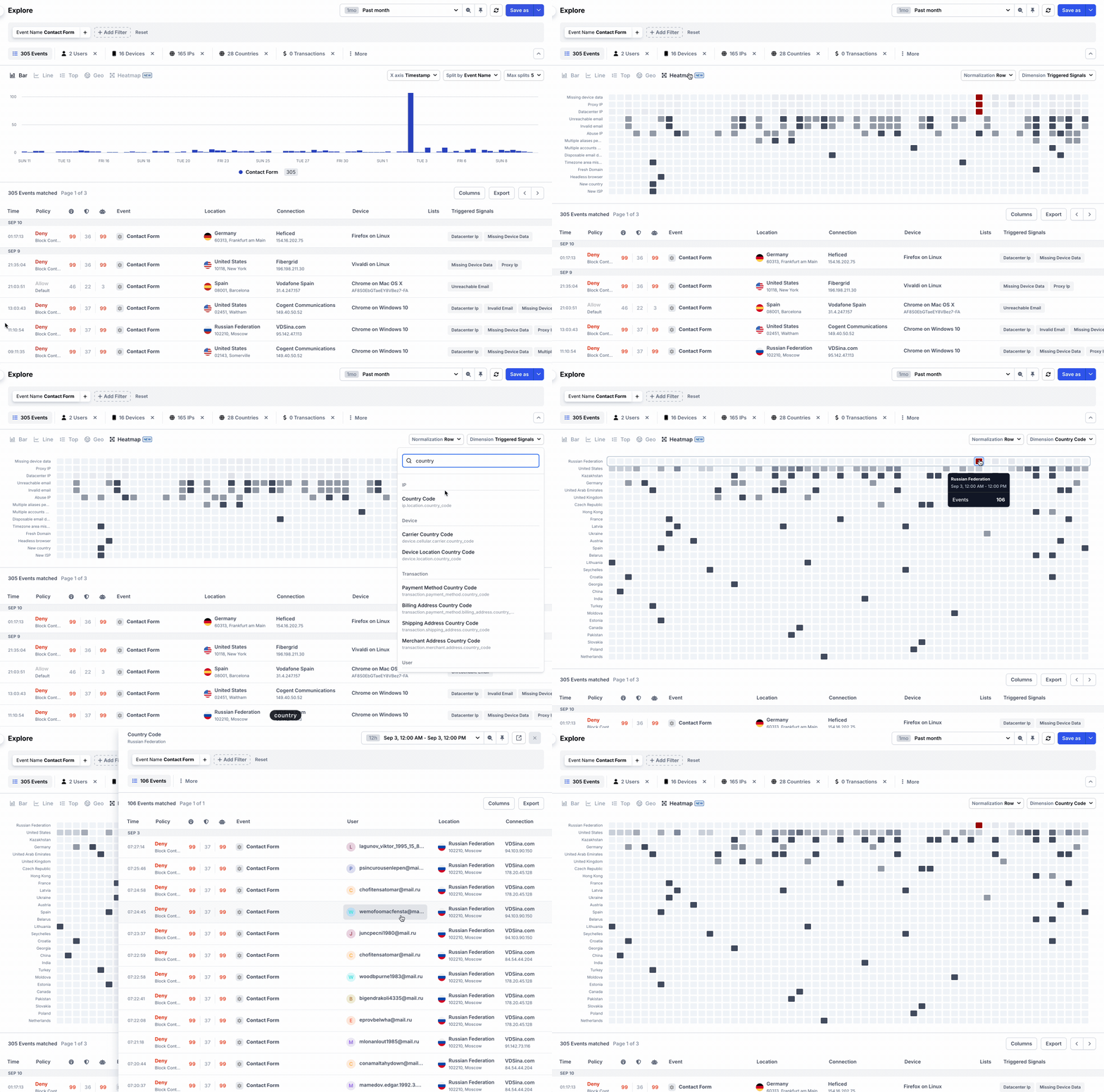
Heatmap visualization
Today, we're excited to launch a new visualization type as part of the charting experience. A heatmap is a great way of capturing three dimensions, to see patterns over time. For example, showing a heatmap of triggered signals in your app, you can easily spot outliers in shady behaviors, such as spam- or credential stuffing attacks.
The coloring of each cell will depend on the volume of event in each cell: the higher the value, the darker the color. On top of this, outliers will be highlighted in different shades of red, depending on how many standard deviations they are over the mean. This makes it even easier to spot outliers!

Heatmap visualization to quickly find suspicious patterns
You can visualize most properties as a Heatmap, including Signals, Countries, Risk Scores, Users or even custom properties. Give it a try today!