Improved
Pie chart for top lists
over 2 years ago by Sebastian Wallin
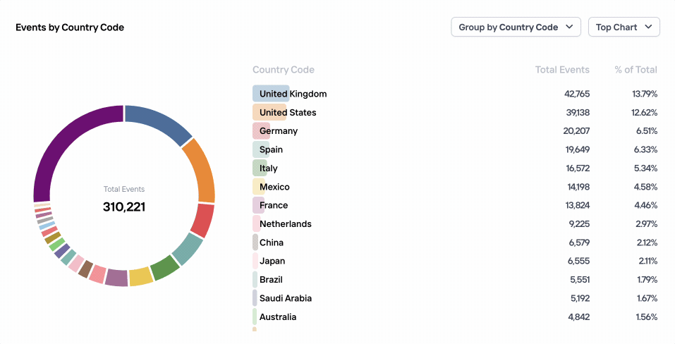
The top chart visualization can be a great way to analyze a slice of traffic, to get a breakdown of eg. the top countries or signals. To make it easier to see the relations between values we've added a new column which shows the percentage, as well as an interactive pie chart visualization which allows you to explore the data further.